
Broken Empire Trilogy Redesign & Slipcase
Getting inside the mind or Jorg
TYPOGRAPHY AND LAYOUT
This is an overview of my book cover redesign of the trilogy Broken Empire by Mark Lawrence, and slipcase packaging design as well. The goal of this assignment was not only to redesign the covers, but to do so in a way that still stayed true and accurate to the stories within, as well as the slipcase as a trilogy overview. Programs used were Adobe Illustrator, Photoshop and InDesign
Research Phase
Learning more than just what’s on the page
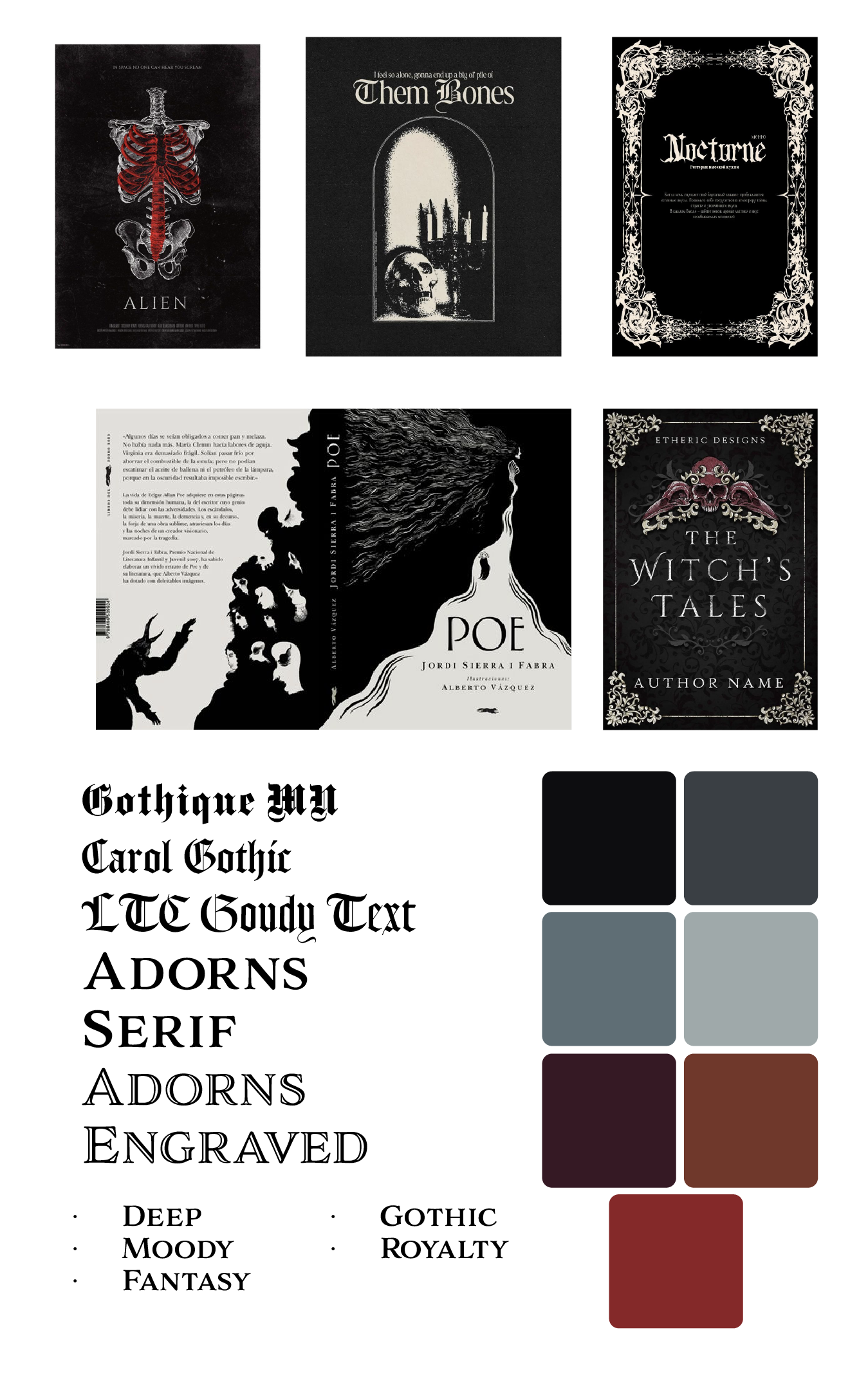
The research portion of this project was actually quite fun, being an avid reader myself. I not only wanted to delve deep into the Broken Empire trilogy, but the general mood and tone of the books as well. That was something I wanted to be accurately represented within my designs. Seeing as Lawrence already has a highly successful following from his other series, I knew that maintaining the same mood as the books when designing the covers was imperative
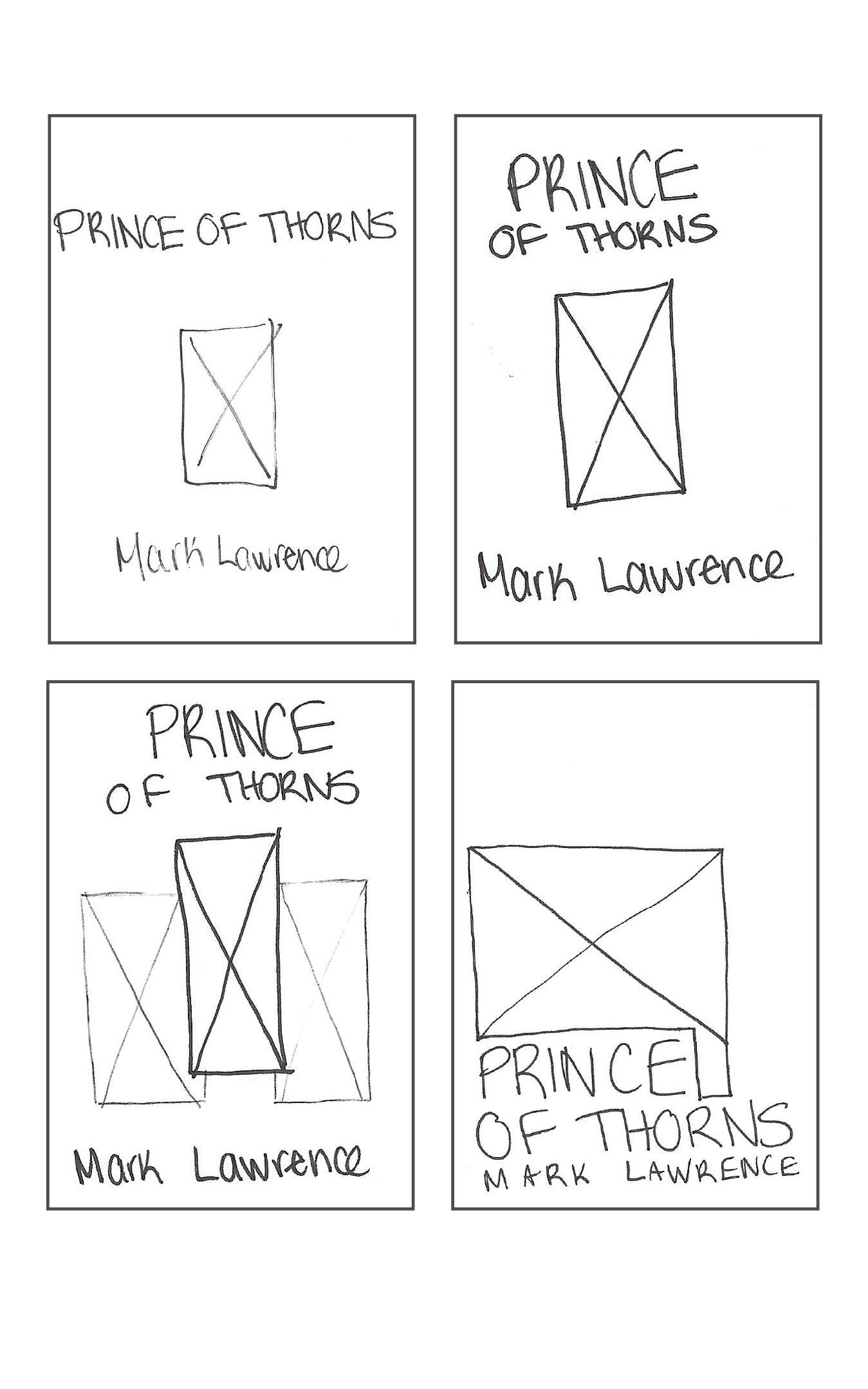
Ideation
Exploring the many different avem
The ideation involved lots of testing, paired with trial and error. After exploring many different avenues, I was set on a design that had a victorian gothic tone - similar to some novel designs in the 1900s, but with through a more modern lens.
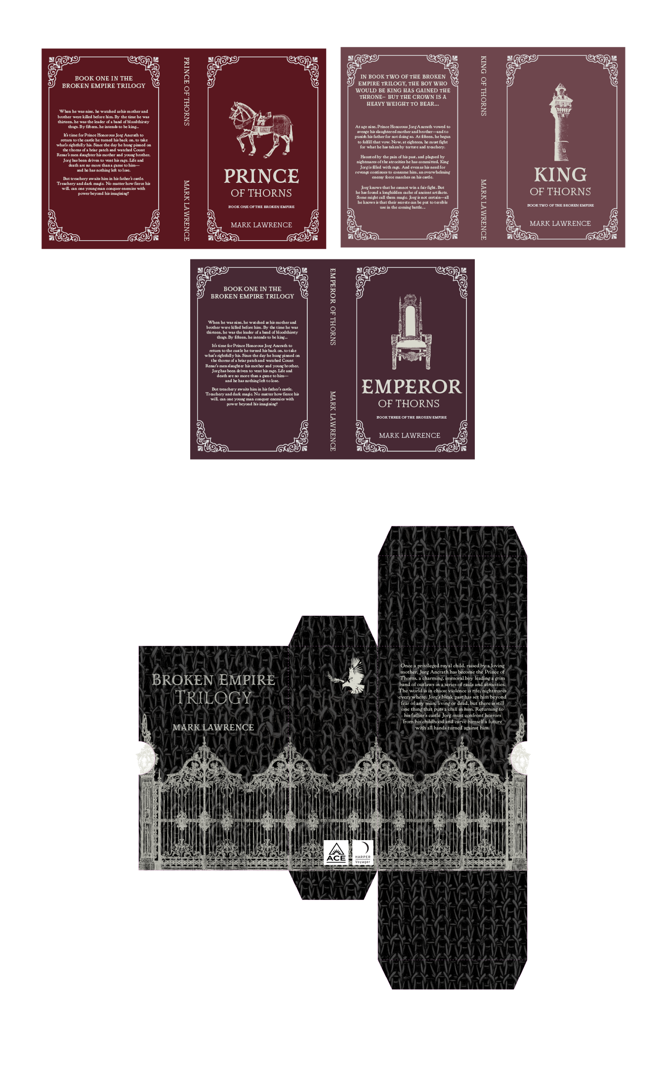
I decided on a colour palette of cooler, dustier shades of mauve, plum and burgundy. This was done skillfully to show the darker, more moodier themes of the books while still being warm in tone to seem inviting to the viewer. Working within that theme, the typeface Mr Darcy was used to help exude those darker and tones, especially when paired with the serif typeface Powell. To truly help tie the design together, gothic-styled borders were implemented into both covers, as well as the spine. The border works in tandem with the subjects on the front of the covers, all being symbolic representations of the stories within.

Execution
Never underestimate the value of test printing
During this phase, some tweaks were made to really help strengthen each piece enough to stand on their own, but even stronger with all collateral paired together. Several adjustments were made to the slipcase, as measurements had to be exact to fit all three books together perfectly. Though some edits were very minor, they helped to ensure a more flawless final product - thus being invaluable.
Final Outcome
Reaping rewards
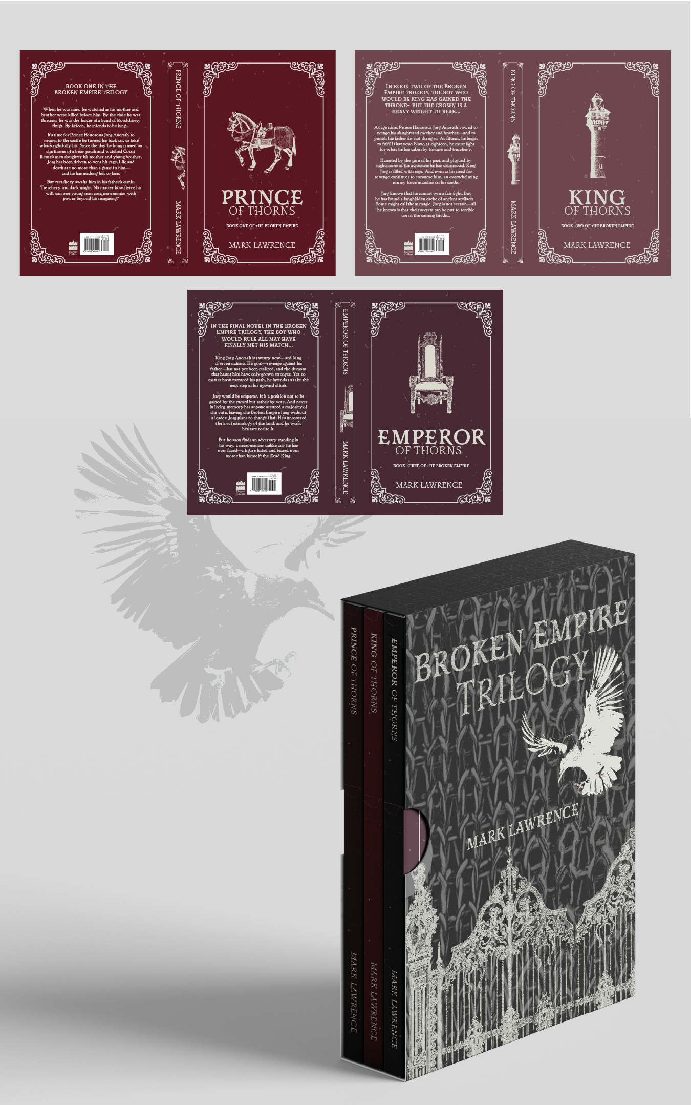
At the very end, I was left with 3 separate book cover designs that on spoke on their own, but together helped tell the story. The slipcase design encapsulates the trilogy as a whole, and helps to speak volumes. With a more modern take on an older design, this eye-catching design not only grabs the viewers attention, but speaks to the story within the pages. This is evident in the gothic, darker mood of the colours, typeface, imagery and treatment used in each design.