Personal Branding
Evolving myself as a designer
BRANDING
This is an overview of my personal branding, and thankfully the client for this project was a fairly agreeable one (and rather cool — but, I digress), and it was really interesting having the ability to take over the creative control a lot more with this one. The intention was to successfully summarize and convey both my personality and design style within the world of graphic design, and successfully market myself as a designer.
The research phase of this assignment looked a little different than previous ones — as gathering information wasn’t revolved around statistics, but more so personal preferences and style. The goal was to find a way to be able to seamlessly convey my alternative style in a way that still maintains the level of professionalism that I bring to the workplace.
Taking a different approach to client research
Research Phase
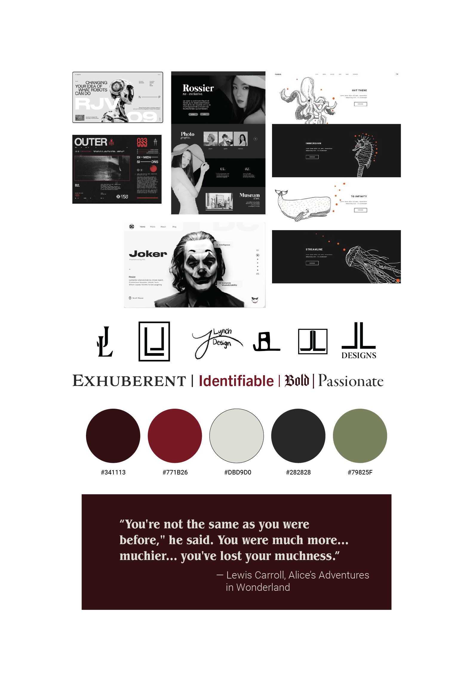
As with all other assignments, getting to the root consisted of mind-mapping, moodboarding, concept sketches, trial and error, and several rounds of feedback. I thoroughly enjoyed the feedback I received during this phase, as it carried a much different effect than standard feedback would.
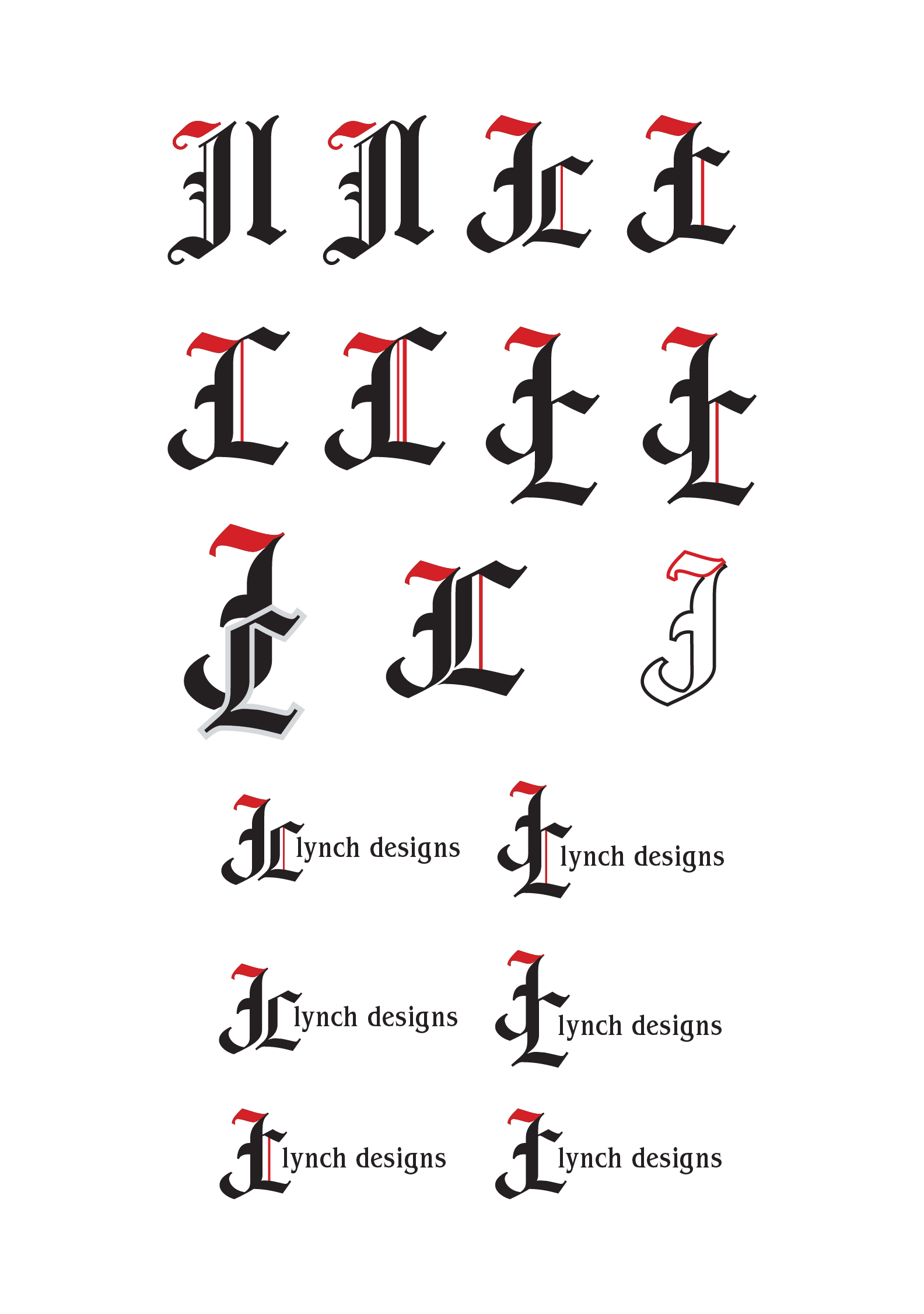
I really wanted to hone-in on really letting my personal branding logo speak for itself, and do so boldly and accurately. I decided that the most effective way to do that was through my colour choice, pattern style and especially typography.
Letting the design juices flow
Ideation
Execution
Unleashing my personal style
The execution phase was truly when I started seeing myself within my personal branding and logo, which was not only exciting but rewarding to see. After a while of trial and error, I discovered a simple, yet highly effective reflection of both myself as a person, and who I am as a graphic designer.
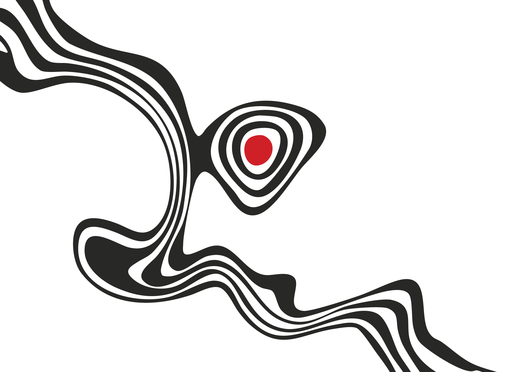
The colour palette, typographical scale and pattern usage come together in a way that truly helps to speak my voice without using any words, and that’s when I knew that I was heading in the right direction.
Final Outcome
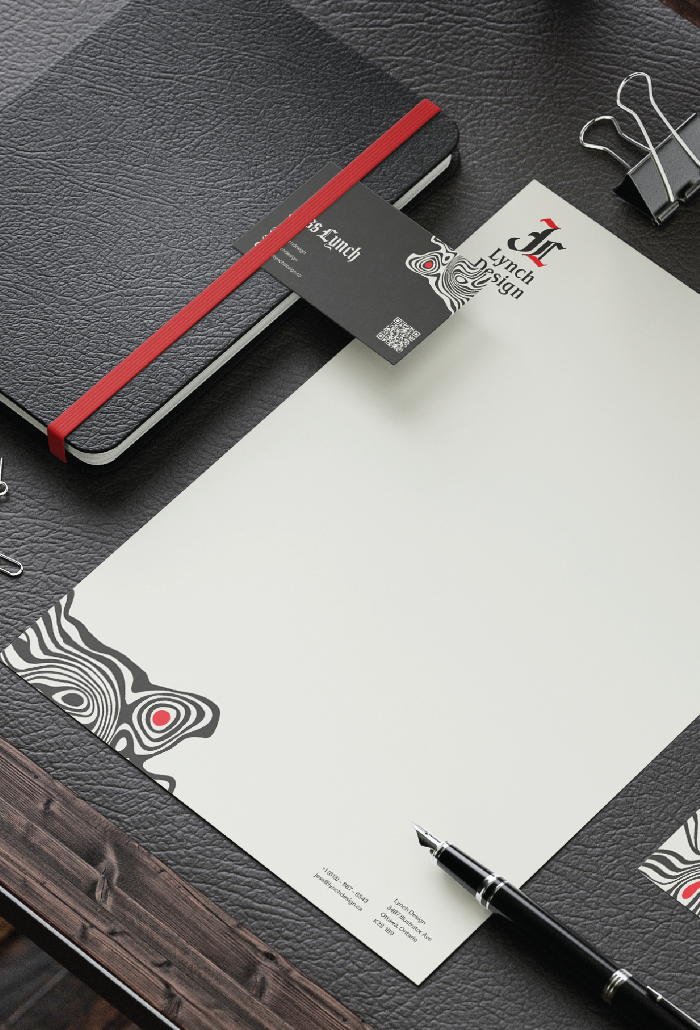
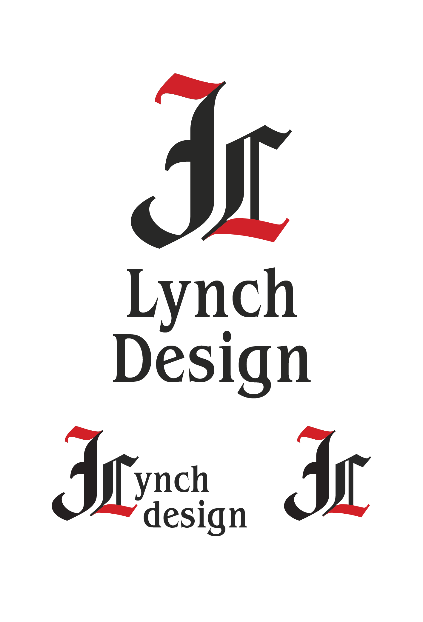
The final outcome of my personal branding both accurately depicted myself in my work, but also successfully conveyed it in a professional tone. The strong typography of Amador Gothic speaks to my different personality and style, but used so very sparingly as I normally do in my day to day. While the pattern design is visually interesting, it carries the symbolism that design is fluid — ever changing and evolving... (Now does that red dot look different to you?). Overall, this was an assignment that I really enjoyed, because I was able to take the reigns and really let my creativity show.
Truly seeing myself in my work