The client for this rebranding project was The Cupcake Lounge, located
in Westboro. The intention of this project was to rebrand the current business
to have their logo and general look & feel better represent and reflect the
brands tone and environment. Program used to complete this project
was Adobe Illustrator.
The Cupcake Lounge
Behind the batter
BRANDING
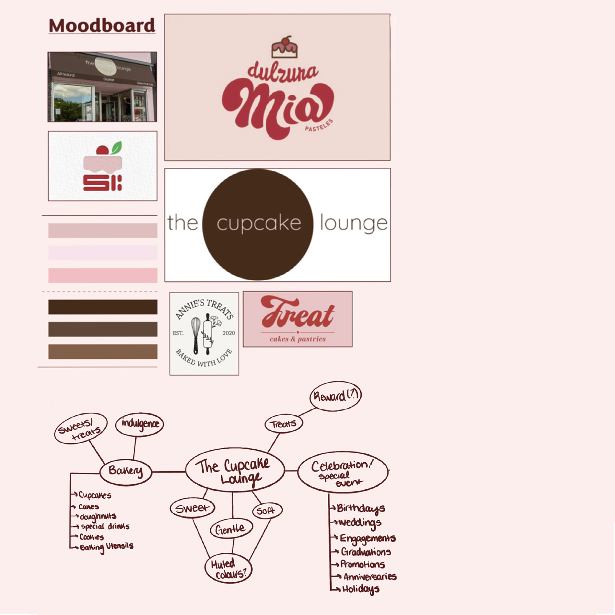
Research Phase
Getting to know the client, and their clientele
The overall challenge was to create a stronger rebrand for The Cupcake Lounge. This was to be done in a way that would embody the overall tone and feel of the business — not introducing a fresh new mood. This was done carefully to ensure customer loyalty remained intact. With the updated rebrand, the end goal was to create a rebrand that would serve as a more accurate reflection of the business, ensure brand advocacy to loyal consumers, and generate interest in new clients.
The research stage of this project consisted of client research, consumer-base research, mood boarding, and analysis. Because I wanted to focus on building this rebrand with brand elements that were currently used, I needed to go more in depth with my client and consumer based research to assure its accuracy. I placed a lot of importance on this, as I really wanted to hone in on clients that already have established brand loyalty.
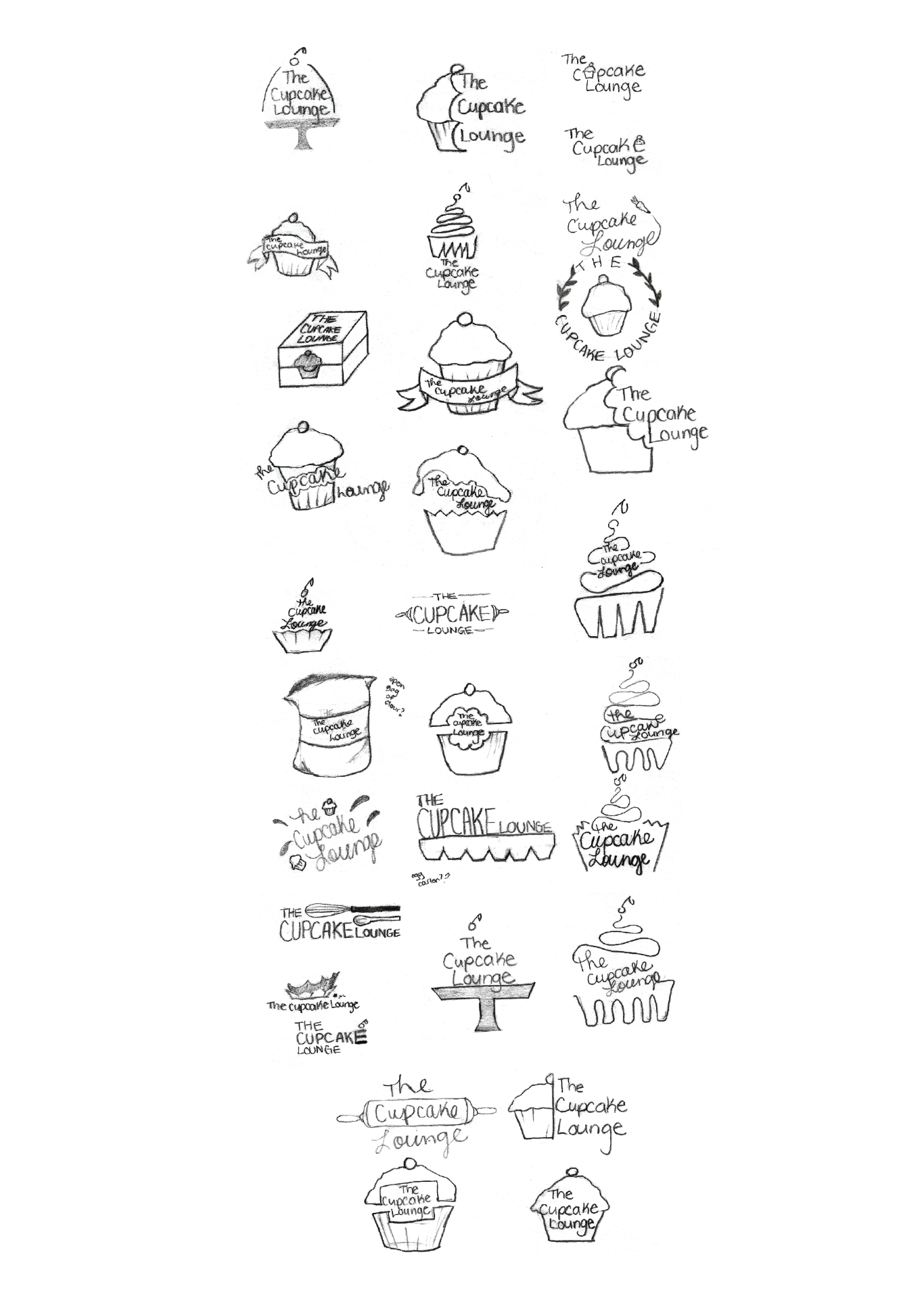
Ideation
The ideation stage comprised of concept sketches, LOTS of revisions, mind mapping, brainstorming, and concept development. Mindmapping took place to help discover new avenues and ideas for concepts. My concept sketches take a more literal approach of a cupcake design.
I really wanted to help incorporate more meaning and symbolism with their logo, as I felt that their original logo was highly interpretative. I wanted to hone in on a design that both successfully conveyed the mood and tone of The Cupcake Lounge, while bringing in some literal meaning — by using the design of a cupcake.
(Finally) putting pencil to paper.
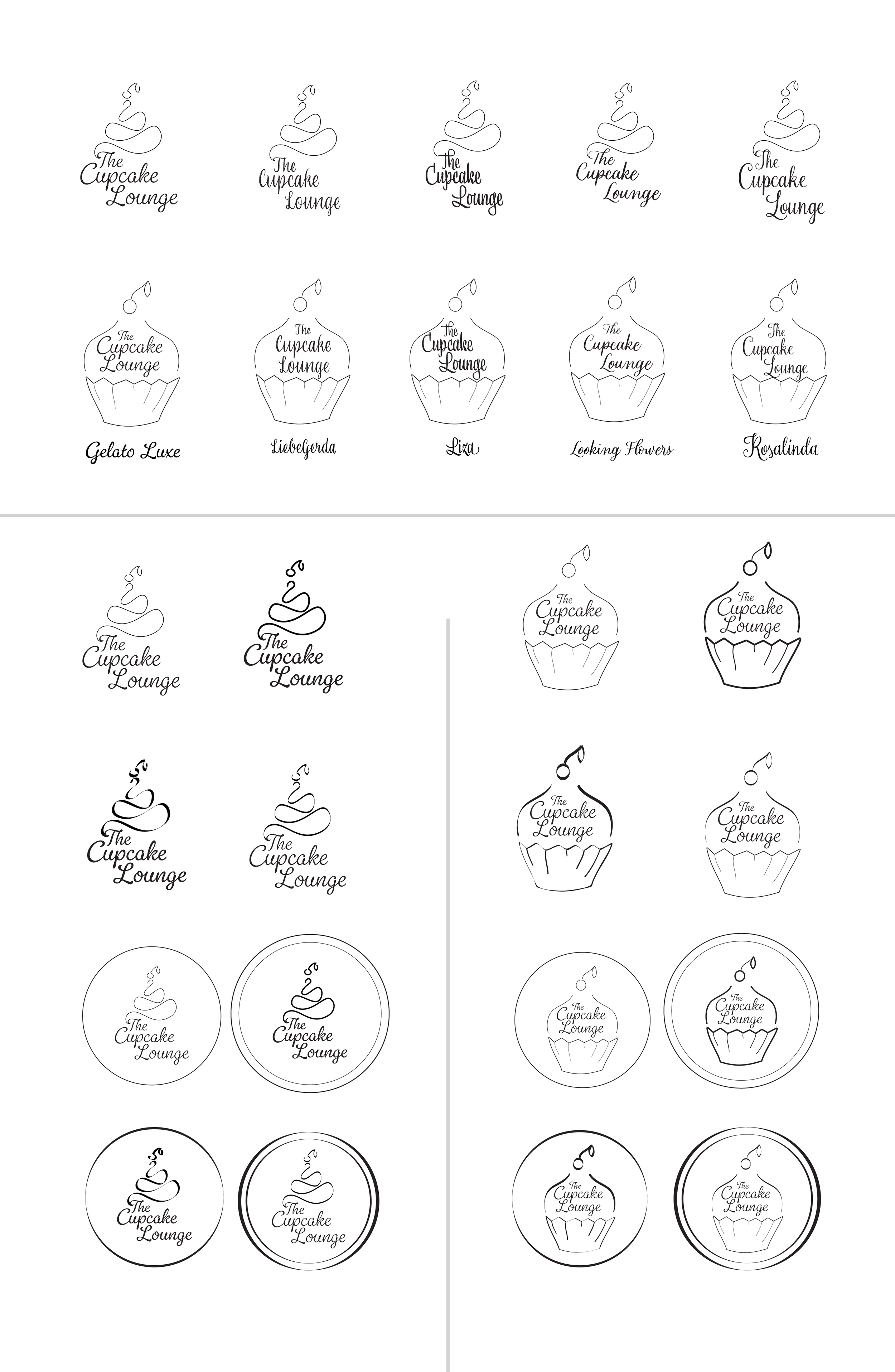
Execution
Test and test again until you find it.
The execution stage is always the most exciting, as I find this is where I see my designs start to breathe life. I had discovered a logo variation from my concept sketches that really spoke to me as being the most accurate reflection, and developed it further. My logo went through a few more rounds of refining before I felt it was at the strength it needed to be. Mockups showcasing final design were created to help showcase effectiveness of rebrand.
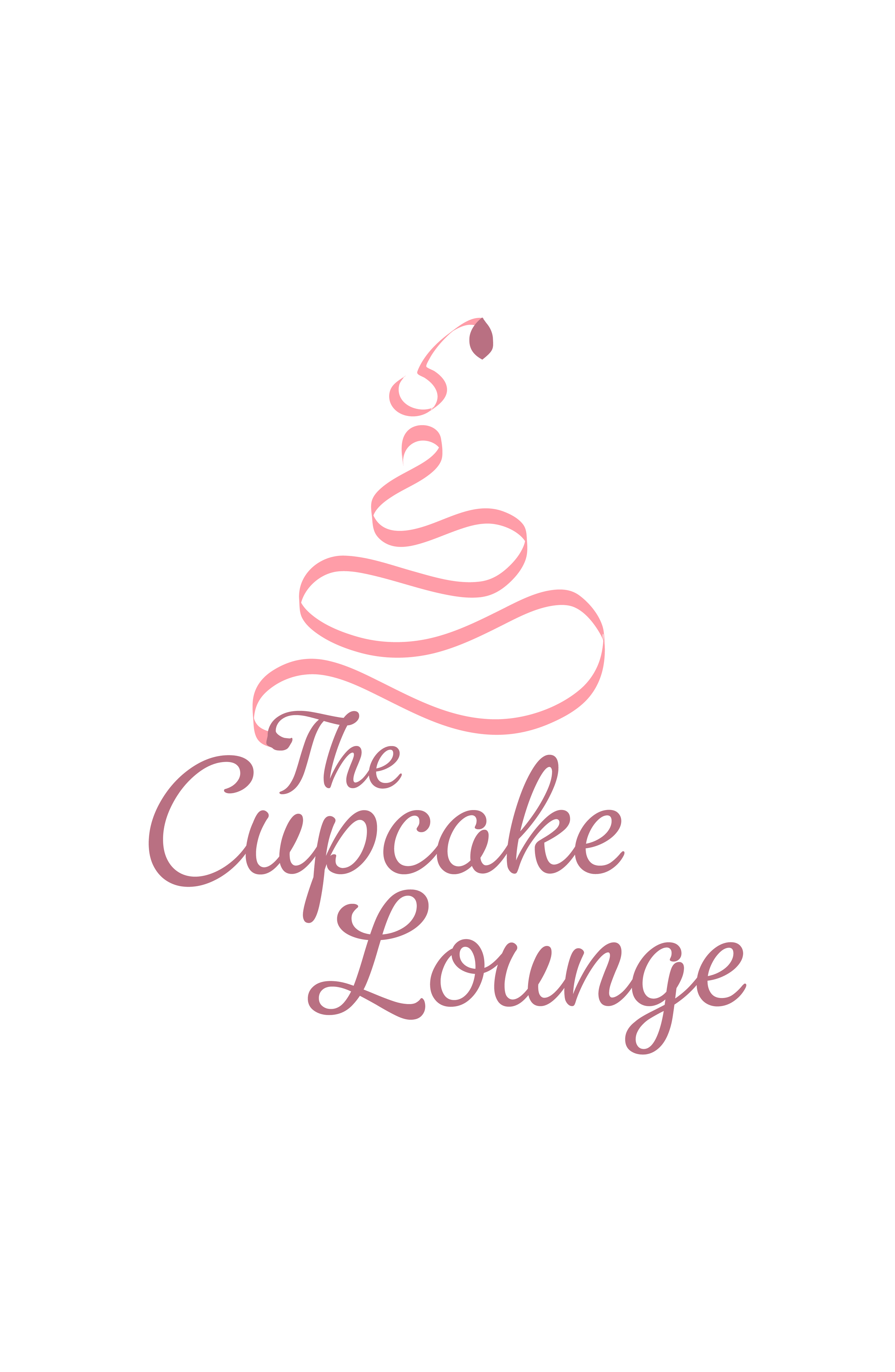
Final Outcome
The final design plays much more into the ‘cupcake-ness’ than the original logo. The colours were used to replicate traditional pink frosting most often seen on cupcakes and traditional bakery items. I decided on incorporating the typeface Gelato into the main logo as I felt it best replicated the look of freshly piped frosting/icing.
With the updated rebrand, this better showcases not just the look and feel of The Cupcake Lounge, but everything that the business is. The fun, personality-filled script typeface used also showcases the large amounts of personality that the business has, evident with their ‘wine and cupcake’ tasting events, Taylor Swift trivia nights, and much more.
Reaping the rewards