Greenie’s Dental Treats
A bite-sized breakdown of the process
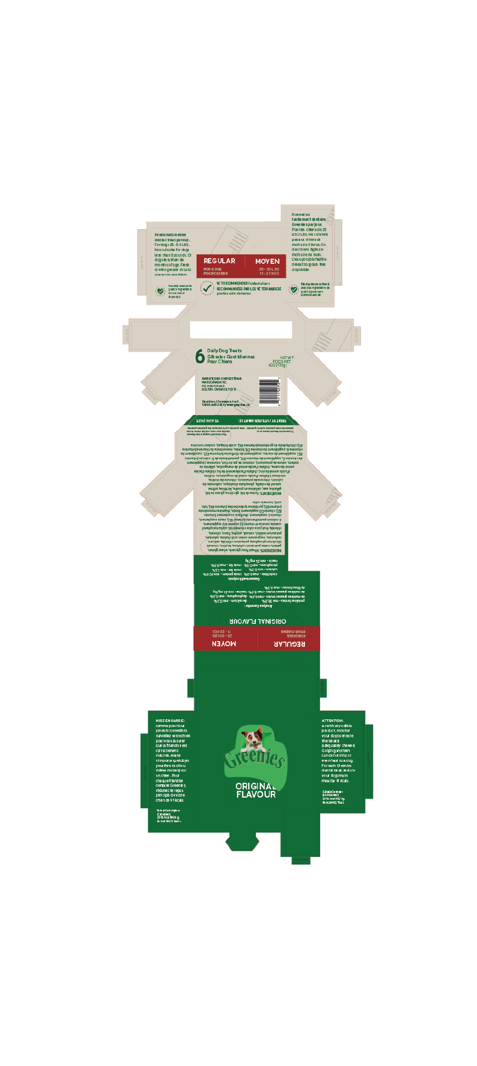
PACKAGE DESIGN
The client for this Packaging Redesign project was Greenies. The objective was to not only create a new, fresh looking package design, but to do so in a way that made the packaging redesign itself more environmentally friendly. The programs used for this assignment were Illustrator, as well as InDesign.
(The two most popular tools in every designer’s tool belt - of course)
The challenge of this project was to not only bring a fresher, newer face to Greenie’s product design. Seeing as how Greenie’s current packaging features non-reusable plastics, the challenge was to also successfully design the packaging in a way that would leave a better environmental impact than the current packaging.
The research portion of this project was very in depth — at times requiring me to physically visit a few different pet stores that would regularly stock Greenies. The research portion encapsulates client research, consumer research, moodboards, as well as rough concept sketches for the dieline. Since Greenies itself is already a highly established brand, I really wanted to dive deep into their brand, tone, values, etc. to ensure I replicate that in the most effective ways.
Getting familiarized with the company
Research Phase
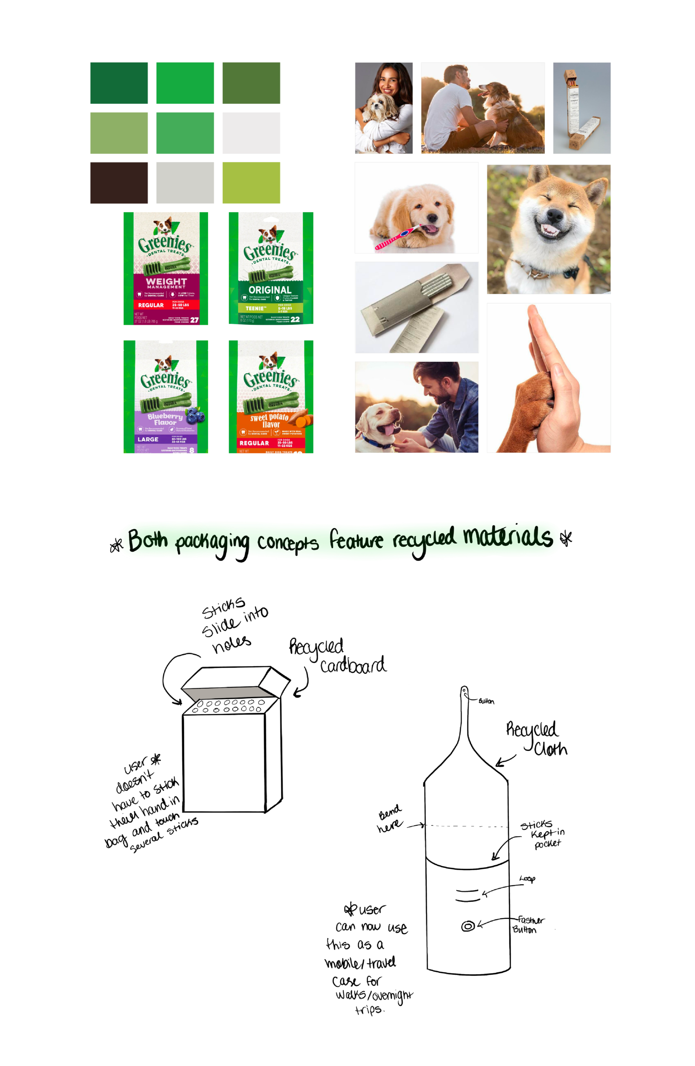
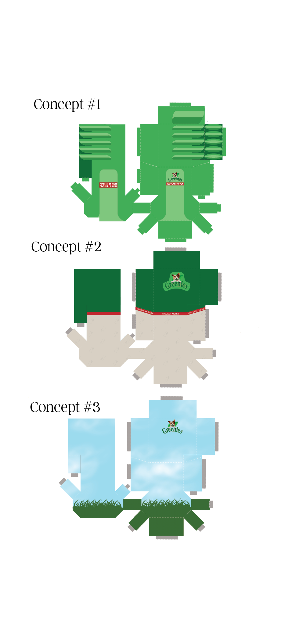
The ideation phase of this project consisted of rough concept sketches, brainstorming/mindmapping, dieline wireframes, as well as rough concept development. I was quite drawn towards a dieline concept where the physical packaging replicated the shape of the Greenie’s dental treats themselves, and decided to really take that and run with it as far as I could go (keeping in mind,
I'm not a runner).
Keeping our furry friends in mind
Ideation
Execution
Measure (ideally, more than) twice, cut once.
The execution of the packaging design was my favourite, as with almost any given project. This stage consisted of taking my narrowed down concept and refining it further, prototyping, and physically assembling the package design once fully complete. All final tweaks were made to ensure a seamless final product in the end.
Final Outcome
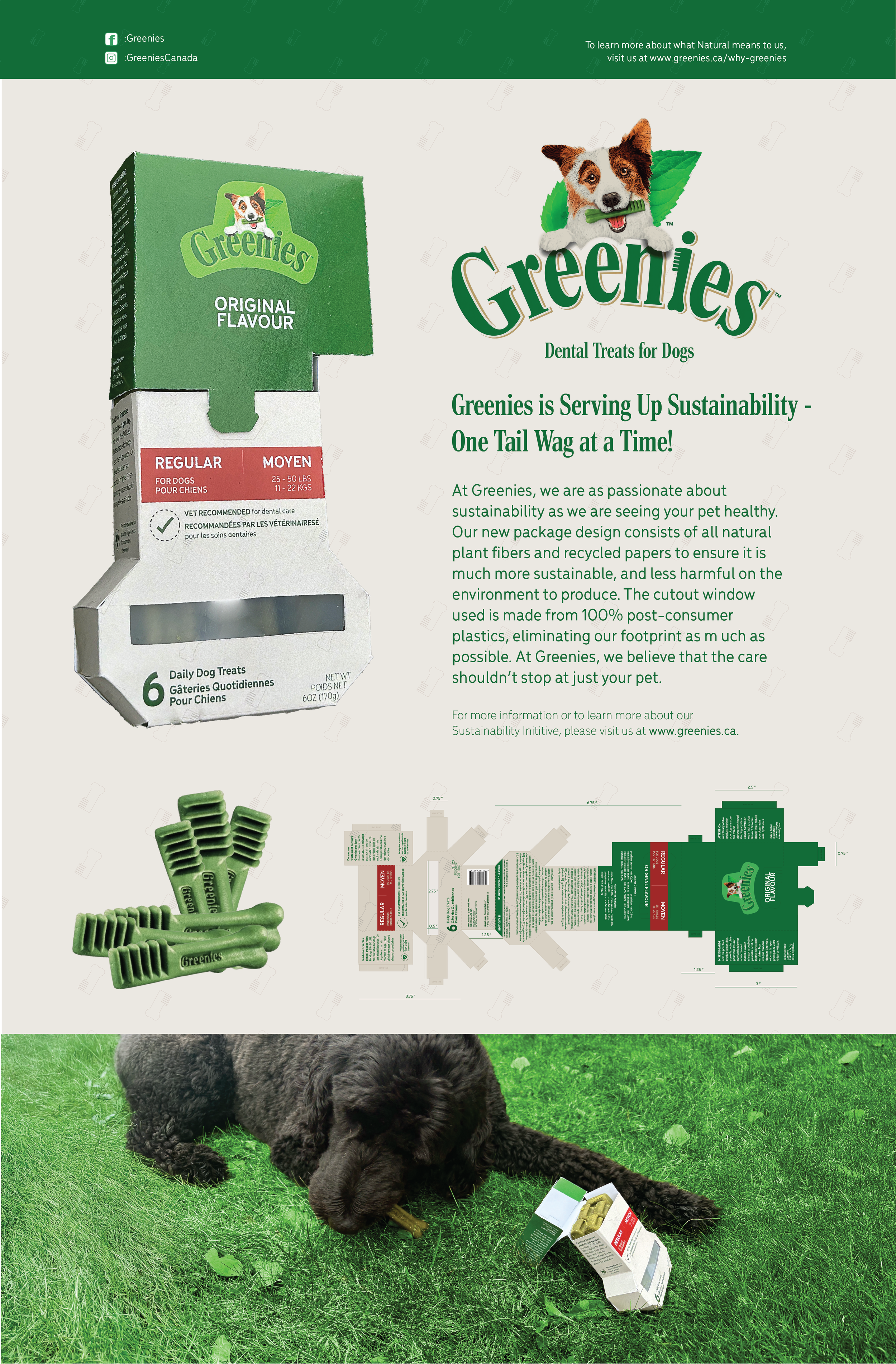
The final design not only carries more ‘spunk’ and personality than the original package, but it does so in a way that is more environmentally conscious. By switching the materials used from non-reusable plastics to recyclable paper with recyclable plastic, this package redesign not only provides a solution for the materials, but does so in a way that visually captivates the consumer.
This is evident with the catchy, evoking typeface used and the patterned background created from the shape of Greenies dental treats. The package redesign is also paired with an advertisement poster, showcasing the product in use alongside the package.
Seeing everything come together